Sound the klaxon! Yield curve inversion ahead!
Yes, it's a popular topic at the moment, and a good example of how narrative follows price. The trend toward inversions has actually been developing since 2011! There are dozens of variations. Just a cursory search on the St. Louis Fed's site (aka FRED) turns up 23 different series. But the 10year-2year and 10year-3 month spreads are widely popular.
Should we pay attention to this, or is it just another attempt by Wall Street to make us do something? Or for media to fill its time and space quotas with pointless stories and simplistic one-sided analyses?
The thrust of commentary largely centers on the implications for a recession. This is sure to stoke fear. The 'R' word creeps in. Recessions can mean people lose jobs, maybe their home or truck, or if they're lucky, only their portfolio gets whacked.
Here are two graphics that show a long history of yields in relation to recessions.
The first one is the 10 year-2 year Treasury note spread. Sure enough, yield inversions-- where the blue line dips below the zero line-- show up about a year or two before recessions.
Here's a similar presentation that shows the 10 year- 3 month spread. Same message.
So, what does history tells us?
- Inverted yield curves usually precede recessions. But the lead time is long. That's because bond traders tend to be right and early.
- Recessions are preceded by stock market weakness, partly because equity traders also tend to be right and early, and partly because recession dating (done by a committee at the NBER) lags the real world. Since the stock market is actually a leading economic indicator, a lot of the financial damage is done before the recession reaches its nadir.
- Hence, recessions and their accompanying stock market declines have proven to be wonderful buying opportunities for informed, disciplined investors like you. The key word there is 'disciplined.'
So, here's the money chart:
This is from the end of WWII.
The red bars mark recessions. The grey bars mark bear markets. Notice that you don't need to be in a hurry with your tactics.
Here's what to do:
- If
a recession developed, imagine what it would be like if a person in
your household lost their job. I know. It won't happen to you, it'll
happen to your neighbor. But imagine it anyway. How might you
proactively prepare for that?
- Households
with large
holdings of individual stocks, usually purchased through employee
purchase
plans, stuffed in 401k's, or are a part of compensation, are hugely
exposed if a company must work through necessary adjustments. I know.
Not your company. Your neighbor's company.
- If your total portfolio is more than 70% allocated to stocks-- even if they are well diversified-- disturbing value
reductions can occur. Of course, they are not "losses" unless you sell. Regrettably,
many people do just that. You've heard the stories.
Between now and some possible future, the stock market could well gather a new head of steam and make new all-time highs. So, here are some questions to ask yourself:
- What do I believe about the future? Investing is about expressing a view of the future.
- What is my edge? What is my level of conviction about what I believe?
- What happens if I'm wrong about what I believe? Am I willing to endure the possible consequences of that?
- If I'm wrong, how will I reset and recover?
I'll spare you the Warren Buffett quote about swimming naked.
In the meantime, I've made a note to self to re-read this a year from now.
Make some notes for your self to re-read a year from now.
I'd love to hear your thoughts and opinions.Additional follow-on comments:
This time it's different?
http://blairbellecurve.com/the-yield-curve-inverted-but-youre-telling-me-this-time-is-different/
👉Update 5-10-19
So, after the inversion that took place a few months ago, there was a minor counter-reaction. This is not unusual; nothing happens in a straight line. But once again we're close to inversion again.
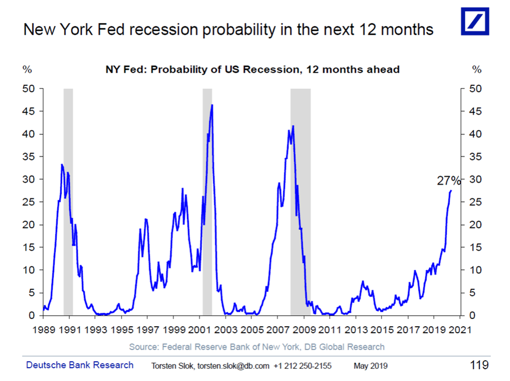
The second chart, below, from the New York Fed, shows that the probability for a recession in the next 12 months could soon be at a non-trivial level. Current hesitation in financial markets is, I believe, more about this than trade issues, the 2020 election, or anything else media babbles about.